Smart Image Delivery: Adaptive Visual Management for Modern Web
Understanding Multiple Image Renditions
Creating multiple versions of each image at different resolutions represents the most effective approach to managing diverse screen categories. This strategy involves generating several image variations specifically tailored for different device capabilities, from high-resolution desktop displays to compact mobile screens.[1][2][3][4]
The process begins with producing a comprehensive set of image renditions, each optimized for specific screen dimensions and resolutions. Web developers typically create versions ranging from small mobile-friendly formats to ultra-high-definition variants suitable for retina displays and large desktop monitors.[5][6][7][8]
Comparison of website speed audit results before and after optimization showing reduced load time from over 5 seconds to 1.8 seconds.
Browser Intelligence in Image Selection
Modern browsers employ sophisticated algorithms to automatically determine the most suitable image version for each user’s browsing context. These intelligent systems evaluate multiple factors simultaneously to make optimal selections that balance visual quality with performance efficiency.[9][7][8]
The browser’s decision-making process considers screen pixel density as a primary factor. Devices with high-density displays require more detailed images to maintain visual clarity, while standard-resolution screens can utilize lower-resolution variants without compromising the user experience.[8][10][11][12]
Network velocity monitoring plays a crucial role in this selection process. Browsers can detect connection speeds and automatically adjust image quality accordingly, prioritizing faster loading times on slower networks while delivering premium quality on high-speed connections.[13][14][15][16]
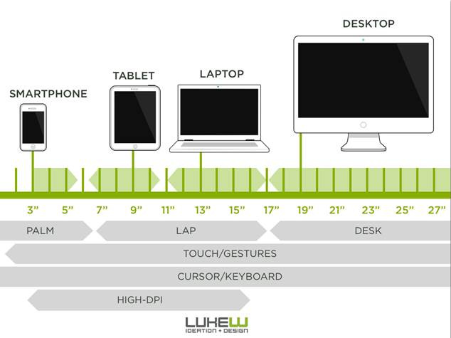
Comparison of screen sizes and device types including smartphones, tablets, laptops, and desktops for responsive design considerations.
Technical Implementation Methods
The HTML srcset attribute serves as the foundation for responsive image delivery. This attribute allows developers to specify multiple image sources with corresponding width descriptors, enabling browsers to select the most appropriate version based on current viewing conditions.[1][3][7][17][18]
<img
srcset=”image-small.jpg 400w,
image-medium.jpg 800w,
image-large.jpg 1200w”
sizes=”(max-width: 640px) 100vw,
(max-width: 1024px) 50vw,
33vw”
src=”image-medium.jpg”
alt=”Adaptive image example”>
The sizes attribute works in conjunction with srcset to inform browsers about the intended display dimensions under various viewport conditions. This combination provides browsers with sufficient information to calculate the optimal image selection before rendering begins.[19][20][8][21][22]
Example of HTML ‘srcset’ attribute usage for responsive images with multiple resolution options.
Advanced Adaptive Delivery Systems
Sophisticated content delivery networks now offer automated adaptive image processing. These systems eliminate manual image preparation by automatically generating multiple renditions from a single source image and serving the most appropriate version based on real-time analysis of user conditions.[23][13][16]
Smart compression technologies analyze image content to apply optimal compression settings. Different images require different compression approaches - detailed photographs benefit from different optimization techniques compared to simple graphics or logos.[13][15][16][23]
Modern format conversion happens automatically based on browser capabilities. Systems can deliver WebP or AVIF formats to compatible browsers while falling back to JPEG or PNG for older browsers, ensuring universal compatibility without sacrificing performance.[14][15][16][13]
Performance Benefits and User Experience
Implementing adaptive image delivery typically results in significant bandwidth savings. Case studies demonstrate byte reductions of 70-90% on smaller screens, where delivering appropriately sized images eliminates wasteful data transmission.[2][3][24][17][15]
Loading speed improvements directly impact user satisfaction and conversion rates. Users on mobile devices with limited bandwidth particularly benefit from receiving optimized images that load quickly without compromising visual quality.[4][6][14][15][2]
The automated nature of modern adaptive delivery removes the complexity burden from developers while ensuring consistent performance across all device categories. This approach allows development teams to focus on content creation rather than manual image optimization tasks.[23][16][25]
Adaptive image management represents a fundamental shift toward intelligent web resource delivery, where browsers and content delivery systems collaborate to provide optimal user experiences across the diverse landscape of modern digital devices.
⁂
1. https://www.keycdn.com/blog/responsive-images
2. https://www.mightybytes.com/blog/optimizing-images-for-responsive-design/
3. https://www.wearediagram.com/blog/optimizing-images-better-web-performance
4. https://www.liquidweb.com/blog/optimizing-images-for-responsive-design/
5. https://support.undsgn.com/hc/en-us/articles/214003845-Adaptive-Images
6. https://elementor.com/blog/how-to-optimize-images/
7. https://developer.mozilla.org/en-US/docs/Web/HTML/Guides/Responsive_images
8. https://www.debugbear.com/blog/responsive-images
9. https://amp.dev/documentation/guides-and-tutorials/develop/style_and_layout/art_direction/
10. https://web.dev/learn/images/descriptive
11. https://html.spec.whatwg.org/multipage/images.html
12. https://danburzo.ro/responsive-images-html/
14. https://tpiros.dev/blog/adaptive-image-loading-based-on-network-speed/
16. https://uploadcare.com/blog/adaptive-image-delivery/
17. https://css-tricks.com/a-guide-to-the-responsive-images-syntax-in-html/
19. https://onpointplugins.com/responsive-image-srcset-sizes/
21. https://web.dev/learn/design/picture-element
22. https://www.w3schools.com/tags/tag_picture.asp
23. https://uploadcare.com/blog/responsive-images-vs-adaptive-delivery/
24. https://webflow.com/blog/image-optimization-for-web
25. https://shortpixel.com/blog/image-cdn/
26.
27. https://web.dev/learn/design/responsive-images
28. https://adaptiveimages.net/docs/embedded/2.0.12.1/editors/
29. https://www.w3schools.com/css/css_rwd_images.asp
30. https://www.w3schools.com/howto/howto_css_image_responsive.asp
31. https://developers.cloudflare.com/images/transform-images/make-responsive-images/
33. https://web.dev/learn/performance/image-performance
34. https://stackoverflow.com/questions/23664132/android-screen-size-and-screen-density-image-selection
35. https://www.cronyxdigital.com/blog/the-ultimate-website-image-guide
36. https://www.clcreative.co/blog/is-it-mandatory-to-keep-images-at-72-dpi-for-web-design
37. https://www.greatfrontend.com/blog/image-performance-techniques


Comments
Post a Comment