How the browser selects the right image
When we try to make simple images responsive, we often encounter a problem. The browser can't always pick up the image size that we need for the layout we've designed, especially when we assume that the image will take up 100 percent of the viewport width.
What is the problem and why does it happen?
In fact, this entire system is designed for speed optimization. The browser wants to figure out which image to download as quickly as possible. The browser selects the image during page loading, before the CSS is parsed and the final layout is created.
As a result, the browser has no idea what we want to do with the image. It doesn't even know what the size of the box in which the image will be placed will be.
Solution for srcset and sizes attributes
To solve this problem, HTML5 gave us two powerful attributes: srcset and sizes. These two attributes work together to help the browser select the right image.
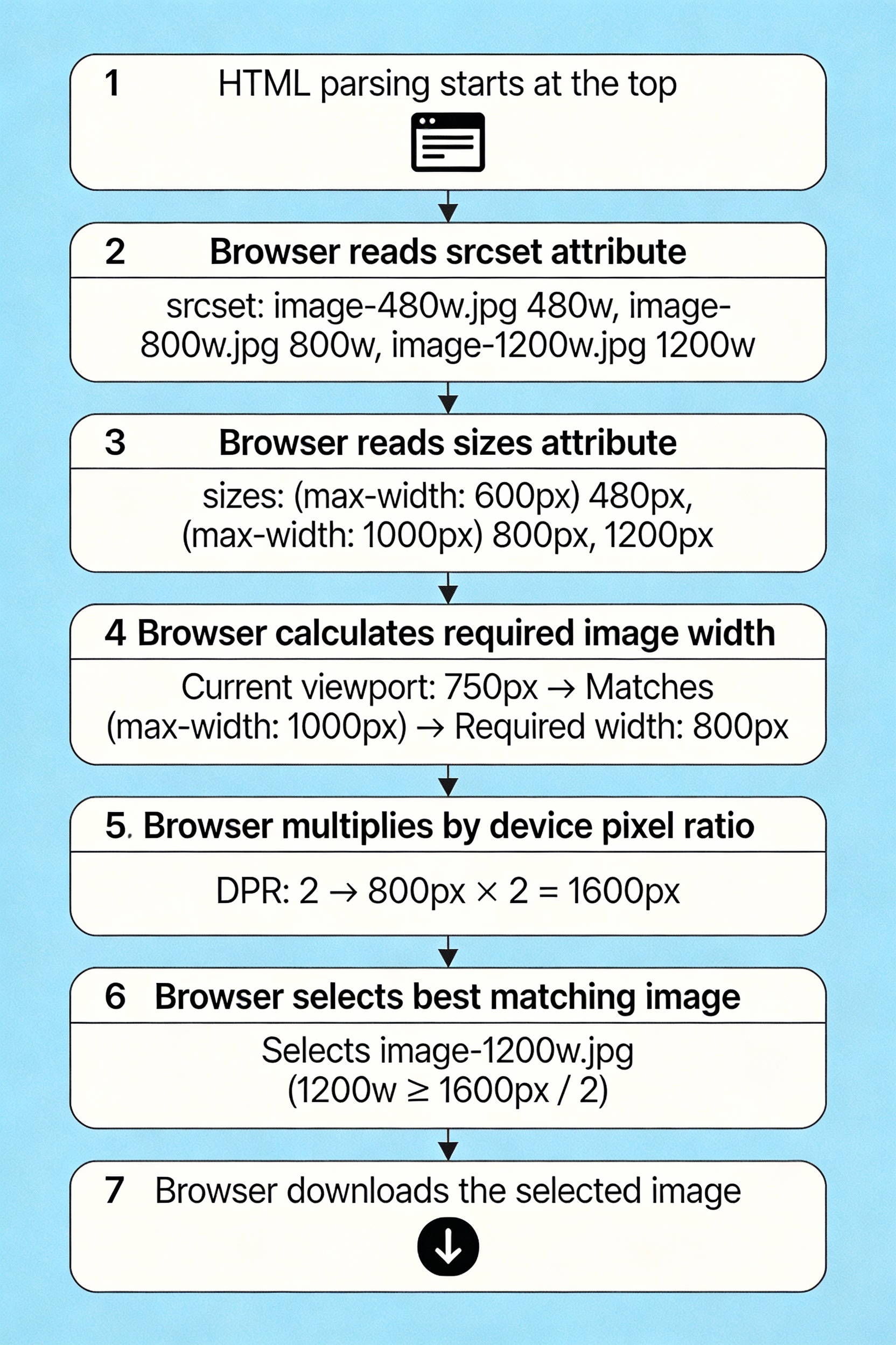
Understand the srcset attribute
The srcset attribute allows us to serve multiple images at different resolutions. The browser then chooses the most appropriate image based on the device pixel ratio and viewport size.
xml
<img
src="image-default.jpeg"
srcset="image-480w.jpeg 480w,
image-800w.jpeg 800w,
image-1200w.jpeg 1200w"
alt="A Responsive Image Example">
Here 480w, 800w, and 1200w are width descriptors. These tell the browser how wide each image is in actual pixels.
Importance of the sizes attribute
Just srcset is not enough. The sizes attribute tells the browser how much space the image will take up on the screen. This helps the browser select the correct image.
xml
<img
src="image-default.jpeg"
srcset="image-480w.jpeg 480w,
image-800w.jpeg 800w,
image-1200w.jpeg 1200w"
sizes="(max-width: 600px) 480px,
(max-width: 1024px) 800px,
1200px"
alt="A Responsive Image Example">
The sizes attribute says: If the viewport is 600 pixels or less, the image will be 480 pixels wide. If the viewport is 1024 pixels or less, the image will be 800 pixels wide. Otherwise, the image will be 1200 pixels wide.

Browser decision-making process
The browser uses this information to select the correct image by following a specific process. First, it determines how large the image should be from sizes . Then, it multiplies it by the device's pixel density. And finally, it selects the image from srcset that is closest to that size.
For example, if a device's viewport is 375 pixels wide and the pixel ratio is 2, the browser will look for an image that is 750 pixels wide.

Optimization for different devices
The goal of responsive images is to provide images of the correct size for different devices. This saves bandwidth on mobile devices and provides high-quality images for desktop users. It also significantly reduces page loading time.
Pixel Density Approach
If you want to display the same image at all sizes, you can use different resolutions based on the pixel density of the device.
xml
<img
src="image-default.jpeg"
srcset="image-small.jpeg 1x,
image-medium.jpeg 1.5x,
image-large.jpeg 2x"
alt="Images for different resolutions">
Here 1x, 1.5x, and 2x are pixel density descriptors. The browser will select the correct image based on the pixel ratio of the device.
Managing complex layouts
If your page layout is more complex, such as with sidebars, the sizes attribute can be more powerful.
xml
<img
src="image-default.jpeg"
srcset="image-400w.jpeg 400w,
image-800w.jpeg 800w,
image-1200w.jpeg 1200w"
sizes="(max-width: 768px) 100vw,
(max-width: 1200px) calc(100vw - 250px),
900px"
alt="Image for complex layouts">
Here we are using calc() so that the browser knows how much space the image will take up after subtracting the sidebar on a larger screen.
Best practices
When implementing responsive images, remember to always use the sizes attribute when you use srcset. Choose appropriate breakpoints based on your layout and test on different devices. Use browser developer tools to verify which images are loading.
Conclusion
The browser image selection process is actually very rational and efficient. When we provide the correct srcset and sizes attributes, the browser can make the best decisions on our behalf. This helps us provide a faster page loading experience for our users, especially on mobile devices where bandwidth may be limited.

Comments
Post a Comment