हाई-रिज़ोल्यूशन स्क्रीन पर बेहतरीन इमेज क्वालिटी कैसे पाएं
आज के समय में हमारे डिवाइस सिर्फ साधारण 1X स्क्रीन नहीं हैं। आधुनिक स्मार्टफोन, टैबलेट और लैपटॉप में हाई-रिज़ोल्यूशन Retina डिस्प्ले आती हैं जो बेहद उच्च पिक्सेल डेंसिटी के साथ तस्वीरों को क्रिस्टल क्लियर दिखाती हैं। ये डिस्प्ले 2X, 3X या यहाँ तक कि 4X पिक्सेल डेंसिटी के साथ आती हैं, जिससे हर विजुअल एकदम तीखा और स्पष्ट दिखता है।[1][2][3][4]
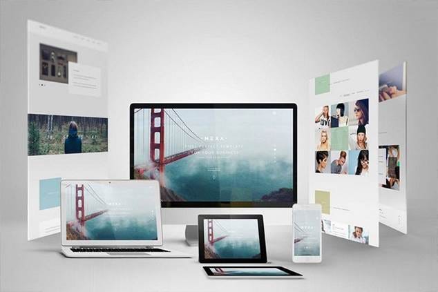
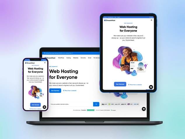
Various devices showing a responsive website design for consistent display across screen sizes.
Retina डिस्प्ले क्या होती है?
Retina शब्द Apple का एक मार्केटिंग टर्म है जो उस डिस्प्ले को दर्शाता है जिसमें पिक्सेल इतने छोटे होते हैं कि आप उन्हें अलग-अलग नहीं देख सकते। Steve Jobs ने बताया था कि एक Retina डिस्प्ले के लिए लगभग 300 PPI (Pixels Per Inch) की डेंसिटी चाहिए होती है जब आप डिवाइस को 10-12 इंच की दूरी पर रखते हैं।[1][3]
Retina डिस्प्ले की विशेषताएं:
· Angular Pixel Density: 52-63 PPD (Pixels Per Degree)[1][3]
· Sharp Text और Images: खासकर जटिल भाषाओं के लिए बेहतर दिखावट[1]
· Wide Gamut Support: DCI-P3 जैसे advanced color formats का समर्थन[1]
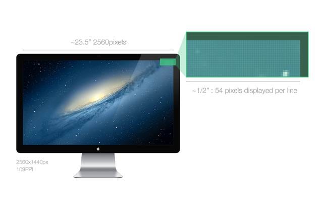
An Apple Retina display showing high pixel density and resolution for clear visuals.
विभिन्न पिक्सेल डेंसिटी कैसे काम करती है?
आजकल मार्केट में विभिन्न प्रकार की स्क्रीन मिलती हैं:[2][5]
डेस्कटॉप डिस्प्ले:
· Standard: 72-96 PPI
· Retina: 218-254 PPI के बीच[6]
· Viewing Distance: 20+ इंच (50+ cm)[6]
मोबाइल डिवाइस:
· iPhone 4 (पहली Retina): 326 PPI[3]
· iPhone 16 Pro: 159 PPD - दोगुना रिज़ोल्यूशन[3]
· Android: LDPI से XXXHDPI तक[2]
विशेष डिस्प्ले:
· Apple Vision Pro: 3,386 PPI[3]
· High-end monitors: 200+ PPI[5]
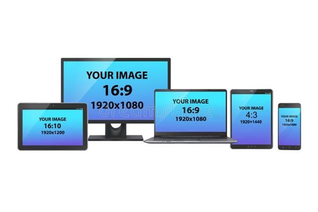
Comparison of various device screen sizes, aspect ratios, and resolutions to understand image display differences.
रेस्पॉन्सिव इमेज क्यों जरूरी हैं?
जब आप एक ही इमेज को अलग-अलग डिवाइस पर दिखाते हैं, तो कई समस्याएं आ सकती हैं:[7][8]
बिना Optimization की समस्याएं:
· मोबाइल पर बड़ी फाइल डाउनलोड होती है (अनावश्यक bandwidth)[8]
· लो-रिज़ोल्यूशन इमेज हाई-DPI स्क्रीन पर धुंधली दिखती है[8]
· पेज लोडिंग स्पीड धीमी हो जाती है[9][10]
Solution के फायदे:
· सही साइज की इमेज सही डिवाइस पर मिलती है[8]
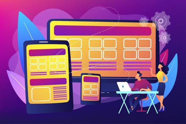
Illustration of responsive web design showing content adapted across desktop, tablet, and mobile devices with varying screen resolutions.
HTML में रेस्पॉन्सिव इमेज कैसे बनाएं?
1. Srcset Attribute का उपयोग
srcset attribute आपको अलग-अलग रिज़ोल्यूशन के लिए अलग इमेज देने की सुविधा देता है[12][13]:
<img src=”image-default.jpg”
srcset=”image-small.jpg 480w,
image-medium.jpg 800w,
image-large.jpg 1200w”
alt=”Responsive Image”>
2. Pixel Density के लिए
विभिन्न पिक्सेल डेंसिटी के लिए इस तरह इस्तेमाल करें:[8][12]
<img src=”image-default.jpg”
srcset=”image-1x.jpg 1x,
image-2x.jpg 2x,
image-3x.jpg 3x”
alt=”High DPI Image”>
3. Sizes Attribute के साथ
sizes attribute ब्राउज़र को बताता है कि अलग-अलग screen width पर इमेज कितनी बड़ी दिखानी है[8][11]:
<img src=”image.jpg”
srcset=”small.jpg 480w, medium.jpg 800w, large.jpg 1200w”
sizes=”(max-width: 600px) 480px,
(max-width: 1024px) 800px,
1200px”
alt=”Responsive Image”>
Picture Element - Advanced Control
<picture> element आपको ज्यादा control देता है[14]:
<picture>
<source media=”(max-width: 600px)” srcset=”mobile.jpg”>
<source media=”(max-width: 1200px)” srcset=”tablet.jpg”>
<img src=”desktop.jpg” alt=”Responsive Image”>
</picture>
ब्राउज़र कैसे सही इमेज चुनता है?
ब्राउज़र निम्नलिखित calculations करता है:[12]
Regular Screen (1X) के लिए:
· Image width ÷ Device width = Ratio
· Ratio 1 के करीब हो तो वह इमेज select करता है
Retina Screen (2X) के लिए:
· पहले ratio calculate करता है
· फिर उसे 2 से multiply करता है
· सबसे उपयुक्त ratio वाली इमेज चुनता है
Responsive web design shown on multiple devices with varying screen sizes.
Performance Optimization Tips
इमेज फाइल साइज़ कम करने के तरीके:
Modern Formats का उपयोग करें:[10]
· WebP: बेहतर compression के लिए
· JPEG: Photos के लिए उपयुक्त
· PNG: Transparent images के लिए
Lazy Loading implement करें:[10]
· Images तभी load हों जब user उन्हें देख सके
· Page की initial loading speed तेज़ हो
Image Compression:[10]
· Quality और file size के बीच संतुलन बनाएं
· Tools का उपयोग करके optimize करें

Mockup showing responsive web design across laptop, tablet, and smartphone screens.
Mobile Optimization के लिए Best Practices
Responsive Design सिद्धांत:[9][15]
· Fluid Grids: Flexible layout बनाएं
· Flexible Images: स्क्रीन साइज़ के अनुसार adjust हों
· Media Queries: अलग-अलग devices के लिए अलग styles
Touch-Friendly Elements:[10][15]
· Buttons पर्याप्त बड़े हों (आसान touch के लिए)
· Elements के बीच उचित spacing रखें
· Accidental clicks से बचने के लिए proper spacing दें
Performance Optimization:[10][15]
· 3 seconds rule: Page 3 सेकंड में load होना चाहिए
· Compressed files का उपयोग करें
· Browser caching enable करें
· AMP (Accelerated Mobile Pages) consider करें
Technical Implementation
CSS Media Queries का उपयोग:
/* Standard screen */
@media screen and (max-width: 768px) {
img { max-width: 100%; height: auto; }
}
/* High DPI screens */
@media screen and (-webkit-min-device-pixel-ratio: 2) {
/* 2x images के लिए styles */
}
Viewport Meta Tag:
<meta name=”viewport” content=”width=device-width, initial-scale=1”>
निष्कर्ष
आधुनिक हाई-रिज़ोल्यूशन स्क्रीन पर बेहतरीन इमेज क्वालिटी पाने के लिए रेस्पॉन्सिव इमेज techniques का उपयोग करना अत्यंत महत्वपूर्ण है। srcset और sizes attributes के साथ-साथ <picture> element का सही उपयोग करके आप यह सुनिश्चित कर सकते हैं कि आपकी इमेज हर डिवाइस पर perfect दिखें।[8][11][12][14]
सही implementation से न केवल visual quality बेहतर होती है, बल्कि page loading speed भी तेज़ होती है और bandwidth की भी बचत होती है। यह SEO और user experience दोनों के लिए फायदेमंद है।
⁂
1. https://en.wikipedia.org/wiki/Retina_display
2. https://unlimited3d.wordpress.com/2019/12/22/scalable-ui-and-high-dpi-screens/
3. https://birchtree.me/blog/retina-is-not-a-static-ppi/
4. https://www.browserstack.com/guide/dpi-and-screen-resolution
5. https://en.wikipedia.org/wiki/Pixel_density
6. https://eclecticlight.co/2022/07/30/explainer-pixel-density-and-display-resolution/
7. https://talent500.com/blog/responsive-images-and-media/
8. https://uploadcare.com/blog/srcset-images/
9. https://www.browserstack.com/guide/mobile-optimization-importance
10. https://nitropack.io/blog/post/increase-mobile-page-speed
11. https://cloudinary.com/guides/responsive-images/what-are-responsive-images-and-6-useful-techniques
12. https://ultimatecourses.com/blog/a-guide-to-responsive-images-with-srcset
13.
14. https://cloudinary.com/guides/responsive-images/responsive-images-in-html-a-practical-guide
16. https://www.reddit.com/r/Windows10/comments/3lolnr/why_is_dpi_scaling_on_windows_7_better_than_on/
17. https://multicians.org/thvv/high-dpi.html
18. https://developer.mozilla.org/en-US/docs/Web/HTML/Guides/Responsive_images
19.
21. https://www.w3schools.com/css/css_rwd_images.asp
22. https://www.reddit.com/r/Monitors/comments/1jxaojs/i_dont_understand_ppi_or_pixel_density/
23. https://corneliusconcepts.tech/i-finally-understand-high-dpi
25.
26. https://www.browserstack.com/guide/ideal-screen-sizes-for-responsive-design
27.
28.
29. https://stackoverflow.com/questions/28374359/media-queries-for-2x-3x-and-4x-images
30.
31. https://emarsys.com/learn/blog/mobile-optimization-strategies/
32. https://developers.cloudflare.com/images/transform-images/make-responsive-images/
33.
34. https://www.symphonicdigital.com/blog/how-to-implement-a-mobile-optimization-strategy
35. https://internetingishard.netlify.app/html-and-css/responsive-images/
36.
37. https://skillfloor.com/blog/mobile-optimization-tips-to-boost-your-sites-performance
38. https://cloudfour.com/thinks/responsive-images-101-part-3-srcset-display-density/
39.


Comments
Post a Comment