Perfect Your Images: Optimize for Any Screen Resolution
The digital landscape has dramatically shifted from the simple “1X screens” of yesterday to today’s sophisticated high-density displays. Modern devices now feature screens with 2X, 3X, and even 4X pixel densities, creating both opportunities and challenges for delivering crisp, stunning visuals across every device type.[1][2][3]
Understanding how to optimize images for these varying screen densities is crucial for maintaining consistent visual quality. Whether your users are viewing content on a standard desktop monitor, a Retina MacBook, or a high-DPI smartphone, your images should appear sharp and professional.[4][5][6]
Understanding Screen Pixel Density
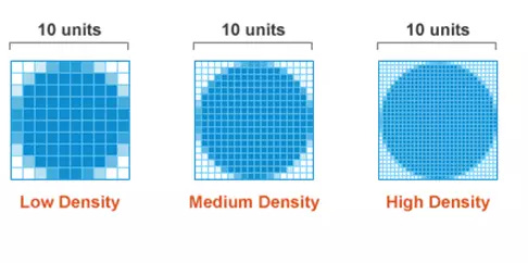
Device Pixel Ratio (DPR) represents the relationship between physical pixels on a screen and logical CSS pixels. A device with a 2X pixel density uses four physical pixels (2x2 grid) to display what appears as one CSS pixel, while 3X density uses nine physical pixels (3x3 grid).[7][8][9]
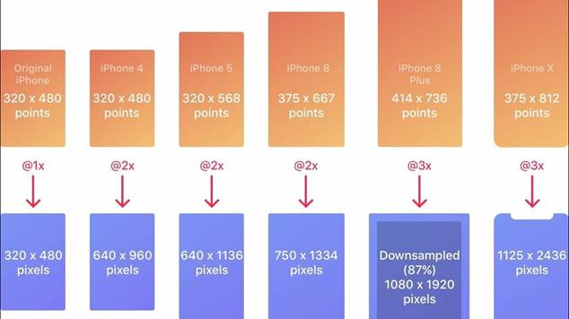
Comparison of iPhone screen sizes and pixel densities at @1x, @2x, and @3x scaling factors.
Common pixel density classifications include:[1][10]
· 1X displays: Traditional screens with 72-96 PPI
· 2X displays: Retina-class screens with double pixel density
· 3X displays: Ultra-high density screens found in premium smartphones
· 4X displays: Cutting-edge displays with exceptional clarity
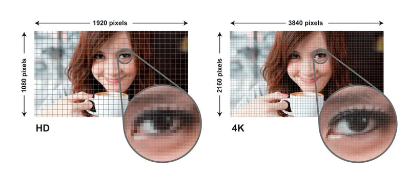
The human eye generally cannot differentiate detail beyond 300 PPI, but high-density screens still provide noticeably sharper text and images, especially for fine details like whiskers, fur, or intricate patterns.[3][10]
Modern Screen Landscape
Today’s devices span an enormous range of screen specifications:[11]
Desktop Screens:
· 1920×1080 (most common)
· 1366×768
· 1440×900
· Up to 5120×2880 (5K displays)
Mobile Screens:
· 360×800
· 390×844
· 414×896
· Pixel densities from 260-600+ PPI
Tablet Screens:
· 768×1024
· 810×1080
· 1280×800
· Medium pixel density (170-350 PPI)
Technical Implementation Strategies
The srcset Attribute
The HTML srcset attribute allows you to specify multiple image versions for different pixel densities:[12][13][14]
<img src=”image-1x.jpg”
srcset=”image-1x.jpg 1x,
image-2x.jpg 2x,
image-3x.jpg 3x”
alt=”Responsive Image”>
Comprehensive Responsive Implementation
For complete control over image delivery, combine srcset with the <picture> element:[3][4]
<picture>
<source media=”(-webkit-min-device-pixel-ratio: 1.5)”
srcset=”image-1000w.jpg 1000w,
image-1500w.jpg 1500w”>
<img src=”image-500w.jpg”
alt=”Optimized responsive image”>
</picture>
Width Descriptors with Sizes
For viewport-based image selection, use width descriptors combined with the sizes attribute:[12][14]
<img srcset=”small.jpg 600w,
medium.jpg 1000w,
large.jpg 2000w”
sizes=”(max-width: 600px) 100vw,
(max-width: 1200px) 50vw,
33vw”
src=”medium.jpg”
alt=”Viewport-responsive image”>
Optimization Best Practices
Compression Strategies for High-DPI
High-density screens allow for more aggressive compression without visible quality loss. The human eye is less sensitive to compression artifacts at higher pixel densities:[3]
· 1X images: Use quality 80+ to maintain sharpness
· 2X images: Can use quality 60-70 without noticeable degradation
· 3X+ images: Quality 50-60 often sufficient due to viewing distance
File Format Selection
Choose appropriate formats based on content type:[2][15][16]
· JPEG: Best for photographs and complex images
· PNG: Ideal for graphics with transparency or sharp edges
· WebP/AVIF: Modern formats offering superior compression
· SVG: Perfect for icons and logos that scale infinitely
Performance Considerations
Images constitute approximately 50% of average webpage weight. Optimization strategies include:[17]
· Lazy Loading: Load images only when they enter the viewport[15][17]
· CDN Usage: Distribute images from servers closest to users[17][15]
· Dimension Specification: Always include width/height attributes to prevent layout shifts[18][17]
· File Size Targets: Keep images under 70KB when possible[18]
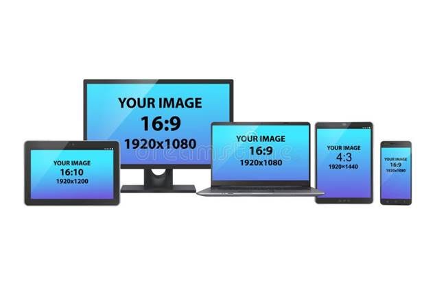
Various device screens with different aspect ratios and resolutions, illustrating the diversity of modern screen sizes.
Mobile-First Approach
With nearly 60% of users accessing websites on mobile devices, prioritize mobile optimization:[2]
· Start with mobile-appropriate image sizes
· Use CSS media queries for device-specific styling
· Implement touch-friendly interaction patterns
· Consider bandwidth limitations on cellular connections
Testing and Validation
Regular testing ensures optimal image delivery across devices:[15]
· Use browser developer tools to simulate different DPR values[19]
· Test on actual devices with varying pixel densities
· Monitor Core Web Vitals, particularly Largest Contentful Paint (LCP)
· Analyze user engagement metrics across device types
Future-Proofing Your Images
As screen technology continues evolving, prepare for emerging display standards:
· Support 4K and 8K resolutions where appropriate
· Implement progressive enhancement for newer image formats
· Consider emerging technologies like foldable screens
· Plan for varying aspect ratios and orientations
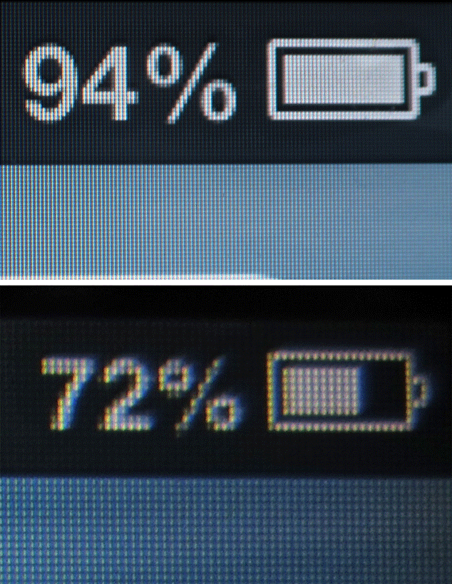
Comparison of battery icons on screens with different pixel densities showing clarity differences.
Conclusion
Optimizing images for modern high-density displays requires a strategic approach combining technical implementation with performance considerations. By utilizing responsive image techniques, appropriate compression strategies, and thorough testing, you can ensure your visuals remain sharp and engaging across every device type.
The investment in proper image optimization pays dividends through improved user experience, faster loading times, and better search engine performance. As screen technology continues advancing, these foundational techniques will help your content remain visually stunning regardless of the display technology your users encounter.
⁂
1. https://unlimited3d.wordpress.com/2019/12/22/scalable-ui-and-high-dpi-screens/
3. https://jakearchibald.com/2021/serving-sharp-images-to-high-density-screens/
4. https://web.dev/learn/performance/image-performance
5. https://developer.mozilla.org/en-US/docs/Web/HTML/Guides/Responsive_images
6. https://web.dev/learn/design/responsive-images
7. https://cloudinary.com/glossary/device-pixel-ratio
8. https://screenresolutiontest.com/screenresolution/
9. https://www.oxyplug.com/optimization/device-pixel-ratio/
10. https://en.wikipedia.org/wiki/Pixel_density
11. https://www.browserstack.com/guide/common-screen-resolutions
12. https://www.dhiwise.com/post/mastering-srcset-html-for-responsive-images-a-practical-guide
13. https://developer.mozilla.org/en-US/docs/Web/API/HTMLImageElement/srcset
15. https://www.hostinger.com/tutorials/complete-guide-to-image-optimization
16. https://webflow.com/blog/image-optimization-for-web
18. https://codefinity.com/blog/Image-Optimization-Tips-for-Your-Website
19. https://developer.chrome.com/docs/devtools/device-mode
20. https://blog.prototypr.io/making-sense-of-device-resolution-pixel-density-40922aeb8a6
21. http://web.simmons.edu/~grovesd/comm328/modules/responsive-media/overview
23. https://uploadcare.com/blog/srcset-images/
24. https://multicians.org/thvv/high-dpi.html
25. https://cloudinary.com/guides/image/dpi-vs-screen-resolution
27. https://www.adobe.com/uk/creativecloud/photography/discover/pixels-per-inch-ppi-resolution.html
28. https://www.reddit.com/r/webdev/comments/wjkhrx/high_pixel_density_for_mobile_contradictory/
29. https://www.browserstack.com/guide/ideal-screen-sizes-for-responsive-design
30. https://www.clcreative.co/blog/is-it-mandatory-to-keep-images-at-72-dpi-for-web-design
31. https://sleeplessmedia.com/articles/optimizing-website-images-and-graphics-for-retina-displays
32. https://www.debugbear.com/blog/responsive-images
33. https://alvacommerce.com/how-to-optimize-images-for-the-web-front-end-developers-best-practices/
35. https://stackoverflow.com/questions/8785643/what-exactly-is-device-pixel-ratio
36. https://developers.google.com/search/docs/appearance/google-images
37. https://www.codeguage.com/v1/courses/html/images-the-srcset-attribute

Comments
Post a Comment